
October 16, 2020
Check my proposed new flag for Kamloops
The current flag of Kamloops is what is known in vexillology circles as a bedsheet — the coat of arms on a white background. There are red bars to the left and right edges, similar to the Canadian flag but slimmer. Arched over the shield are the words “City of Kamloops”.
It was designed by former mayor Jim Walsh and adopted on Oct. 1, 1985. Sorry, Jim, but it’s atrocious on every level.
With the bar set low for improvement, I tried my hand at creating a new one.
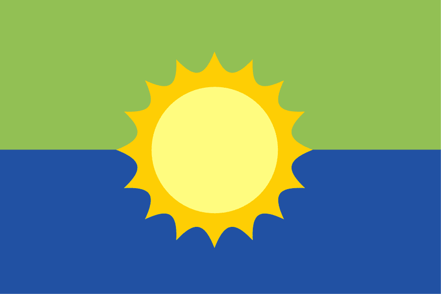
The blue represents the confluence of the two rivers that trisect the city. The green represents the sagebrush on the mountains and hills that surround the city. The sun represents our optimism and connection to both nature and natural resources. It also alludes to the 316 days with sunshine that brighten our lives in an average year.
The yellow of the corona and the blue of the rivers are borrowed from the flag of British Columbia as an homage to the province.
For awhile I was hung up on having the flag more obviously represent the confluence of the rivers. After all, the word “Kamloops” is an anglicization of the Indigenous word denoting the meeting of two rivers.
Someone made a flag like this for Kamloops in a contest on the vexillology subReddit. It looks pretty good. And one of the better city flags, St. Louis, beautifully represents the confluence of the Mississippi and the Missouri.
Either way, I didn’t feel that I could compete.
I had in my mind one of my favourite world flags — Ukraine. It’s yellow on the bottom and blue on the top, representing blues skies over yellow wheat fields. It’s perfect.
For Kamloops I’m proposing green sage over blue river. I could stop there if this were a country flag, but a city flag can afford to be more homey. Thus the addition of the sun.
Things I’m not sure about:
1. The colour of the sage may be overly optimistic. It’s normally a duller colour, but I can’t see that looking good on a flag.
2. The sun might be cartoonish, but it’s the best I can do for now given my limited artistic abilities. I might do an update if I can come up with something better. It also might be too big.